

Public Community Notes–style programs produce rich tabular exports: every note on a post, every rating of a note, status metadata for moderation and modeling, participant enrollment, and bat signal rows that describe when tweets become eligible for note requests in different product surfaces. This post analyzes a large local snapshot of the Community Notes download data (stored under the repository’s x/ directory)—on the order of tens of gigabytes across sharded TSV files—using DuckDB to run full scans for exact counts and aggregates, while keeping pandas only for small result tables when plotting.
The goal is not to identify individuals or quote user text at scale, but to describe structure and scale: how activity grew over time, how notes are labeled, how raters use helpfulness dimensions, how statuses cluster, and how contributors are distributed.
Executive summary
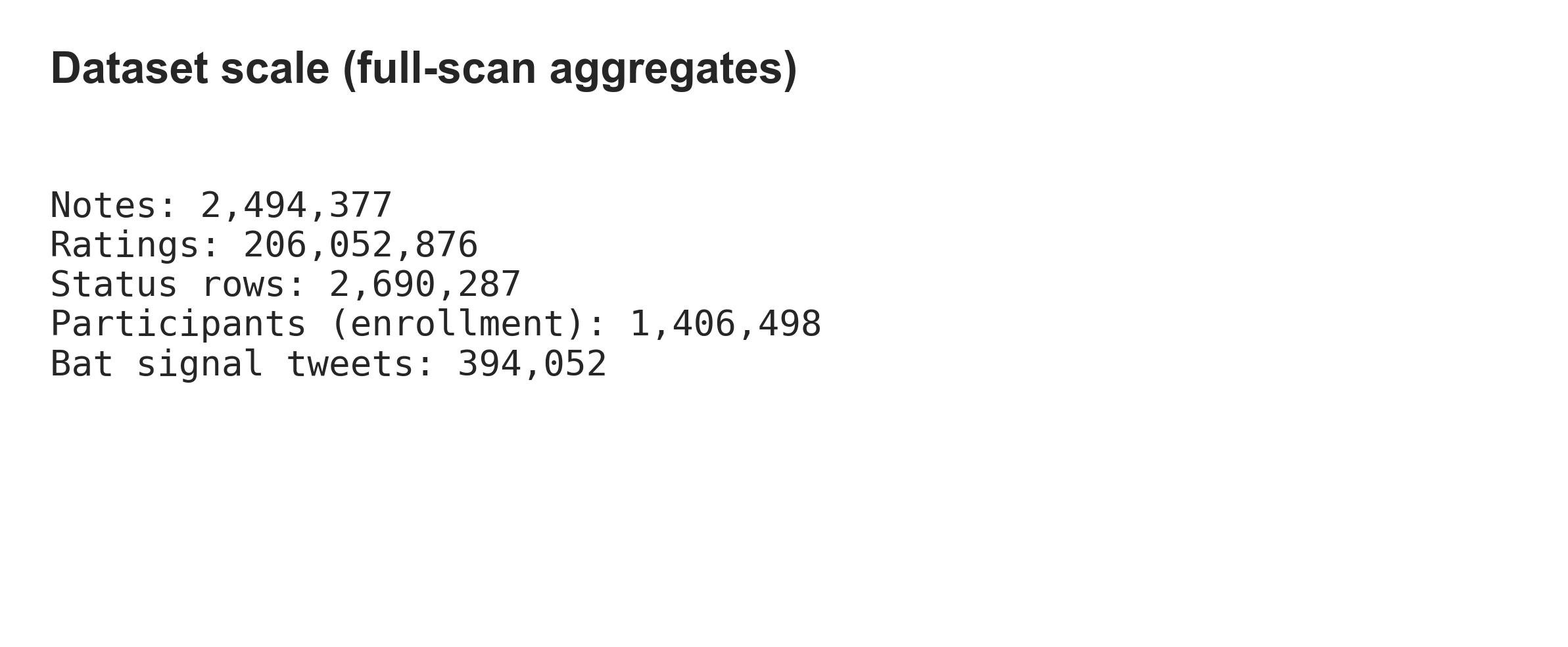
Using one canonical notes file and one canonical status file (duplicate exports exist in the folder; see Methodology), the measured row counts are:
| Table | Rows |
|---|---|
| Notes | 2,494,377 |
| Note status / history | 2,690,287 |
| Ratings (8 shards combined) | 206,052,876 |
| User enrollment | 1,406,498 |
| Bat signals (tweet-level) | 394,052 |
Time span (epoch milliseconds in source data): notes run from 2021-01-28 through 2026-03-17; ratings from 2021-01-23 through 2026-03-18 (UTC, from export min/max timestamps). These are snapshot bounds, not a claim about program start dates elsewhere.
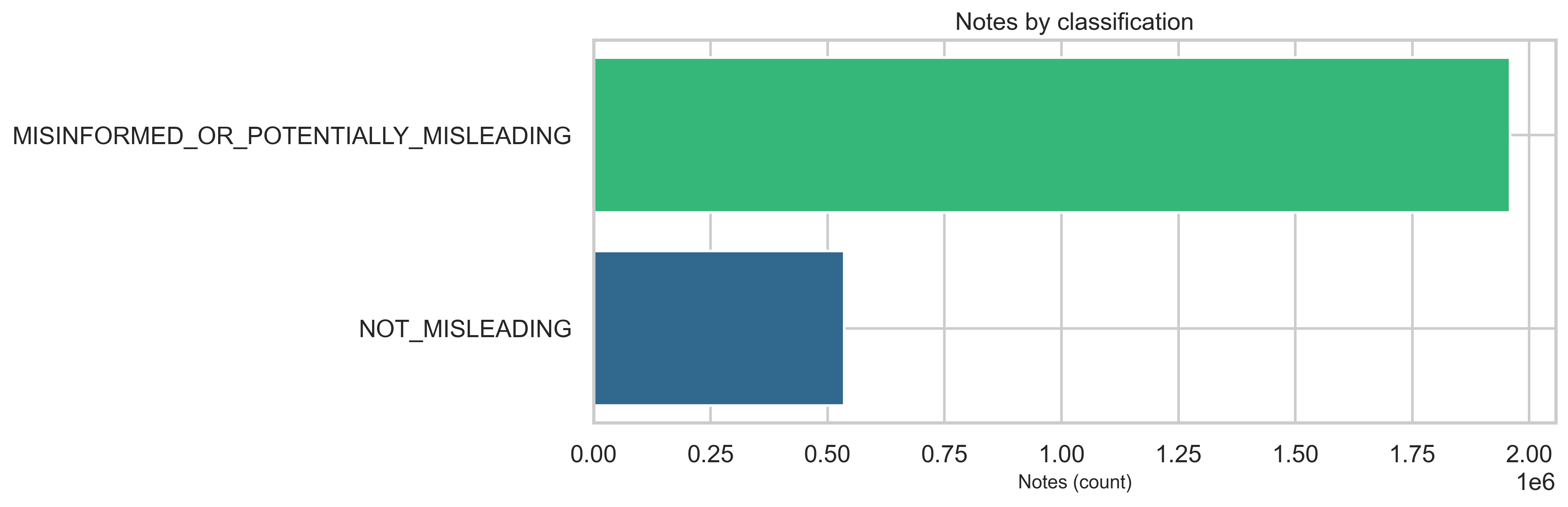
At the classification level, MISINFORMED_OR_POTENTIALLY_MISLEADING notes dominate the labeled set relative to NOT_MISLEADING in this export (see chart below)—about 78.5% (~1.96M) misleading vs 21.5% (~536K) not misleading. The overall ratings-to-notes ratio is ~82× (206M ratings for 2.5M notes). At the rating level, the helpfulnessLevel field carries most of the signal—HELPFUL and NOT_HELPFUL account for the vast majority of rows—while legacy agree / helpful binary columns are sparse in this extract (detailed in Ratings and helpfulness).
Methodology
- Engine: DuckDB reads tab-separated files with
read_csv_auto,delim='\t',ignore_errors=truefor robustness on edge rows. - Ratings: All eight
ratings-*.tsvshards are combined in SQL as a single logical table for aggregates. - No whole-file pandas loads: Aggregates are written to
analysis/community_notes/out/*.csv; plotting reads only those small files. - Duplicates: Two pairs of note files share MD5 checksums (
notes-00000.tsvwithnotes-00000 2.tsv, andnotes-00000 3.tsvwithnotes-00000 4.tsv), but the two pairs differ from each other—they are different snapshots. Analysis usesnotes-00000.tsvonly. BothnoteStatusHistory-00000.tsvfiles match; one is used. - Privacy: We report histograms and sums only; note text is not reproduced here. Participant identifiers are not listed.
- Runtime: A full pass on this machine took about 5.4 minutes for all aggregates (see
out/metadata.json); ratings shard scans dominate.
Community activity: growth and intensity
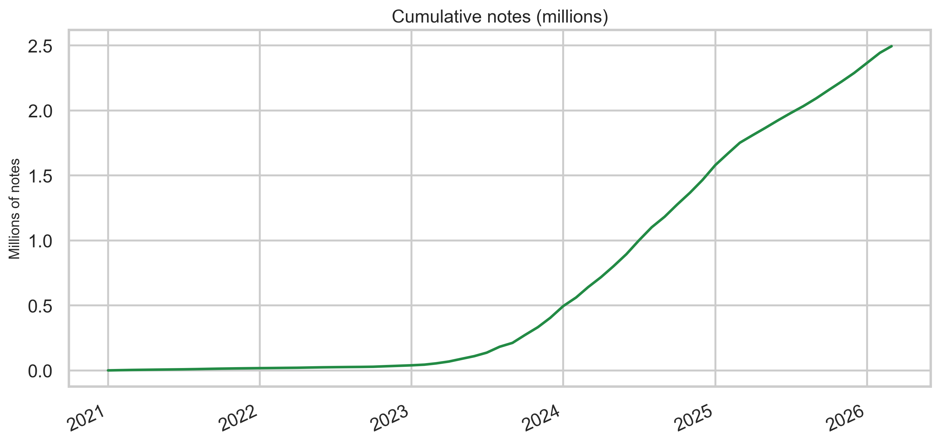
Notes over time
Monthly new-note volume rises sharply in the early years and remains high through the export window, with cumulative growth reaching millions of unique note rows in this snapshot.
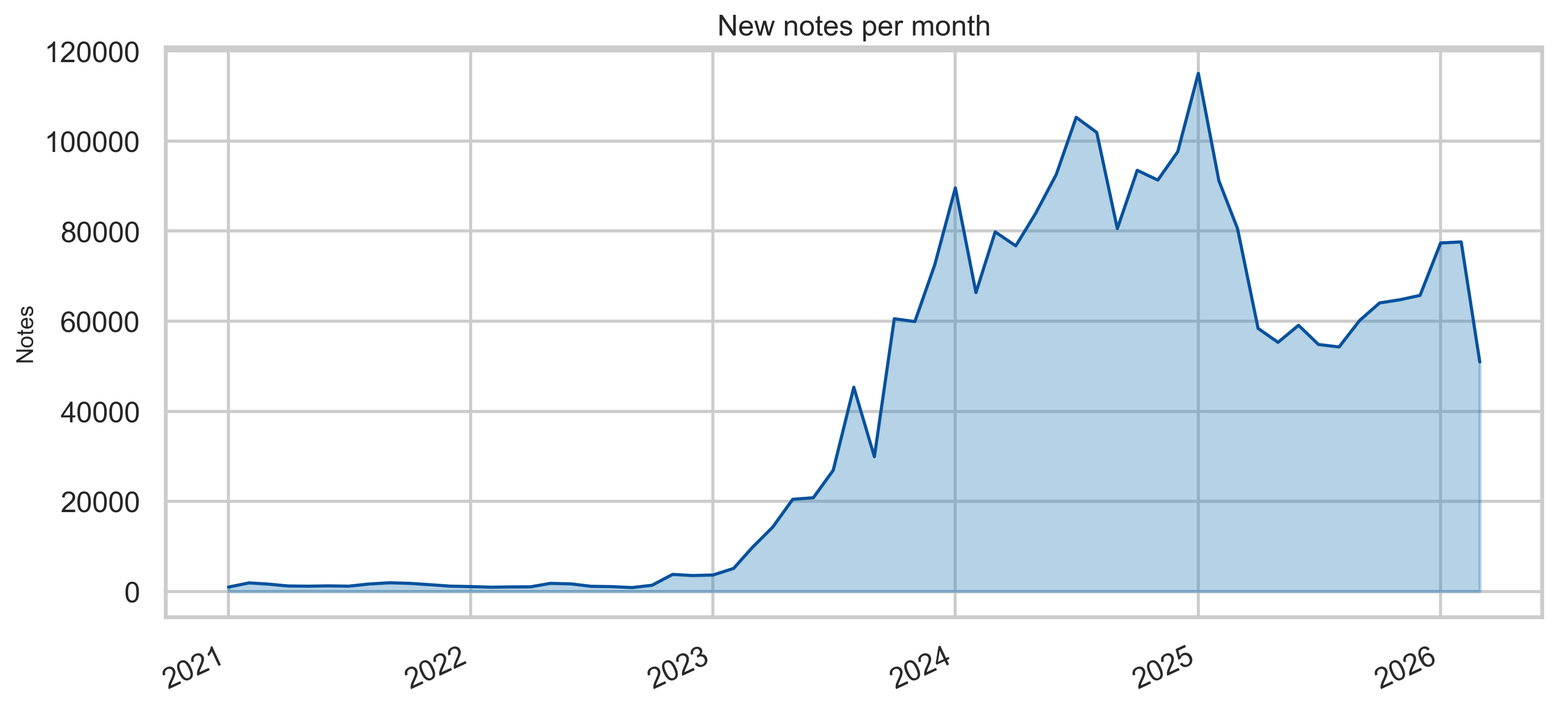
Peak monthly volume is sustained through the export window, with growth in the early years leveling into a high ongoing rate.
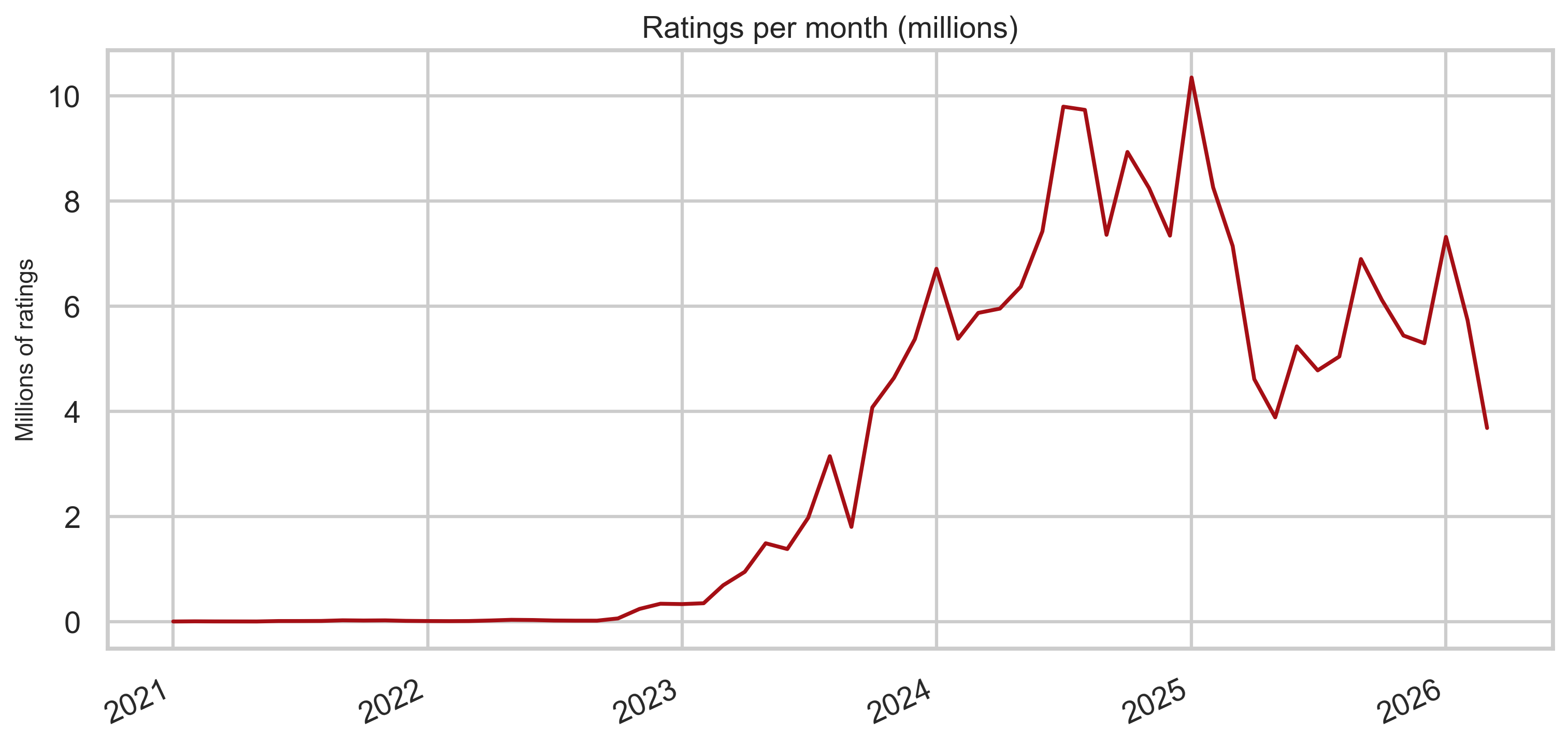
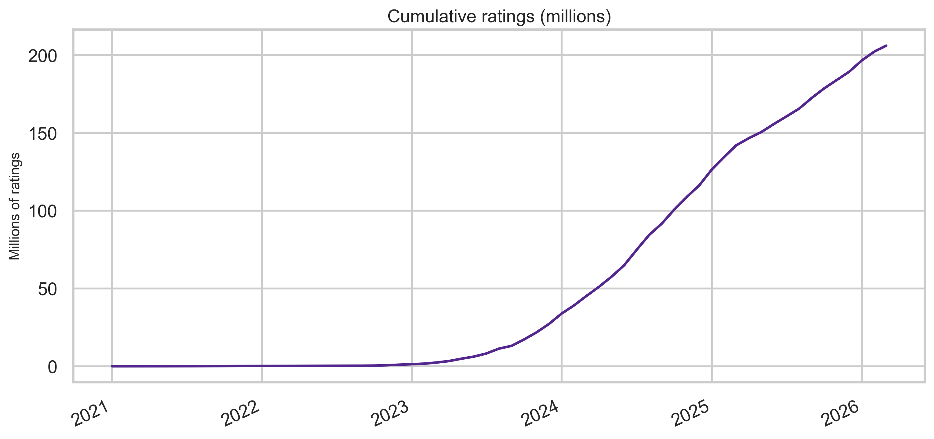
Ratings over time
Rating volume is larger by orders of magnitude than note volume—consistent with many raters per note in aggregate.
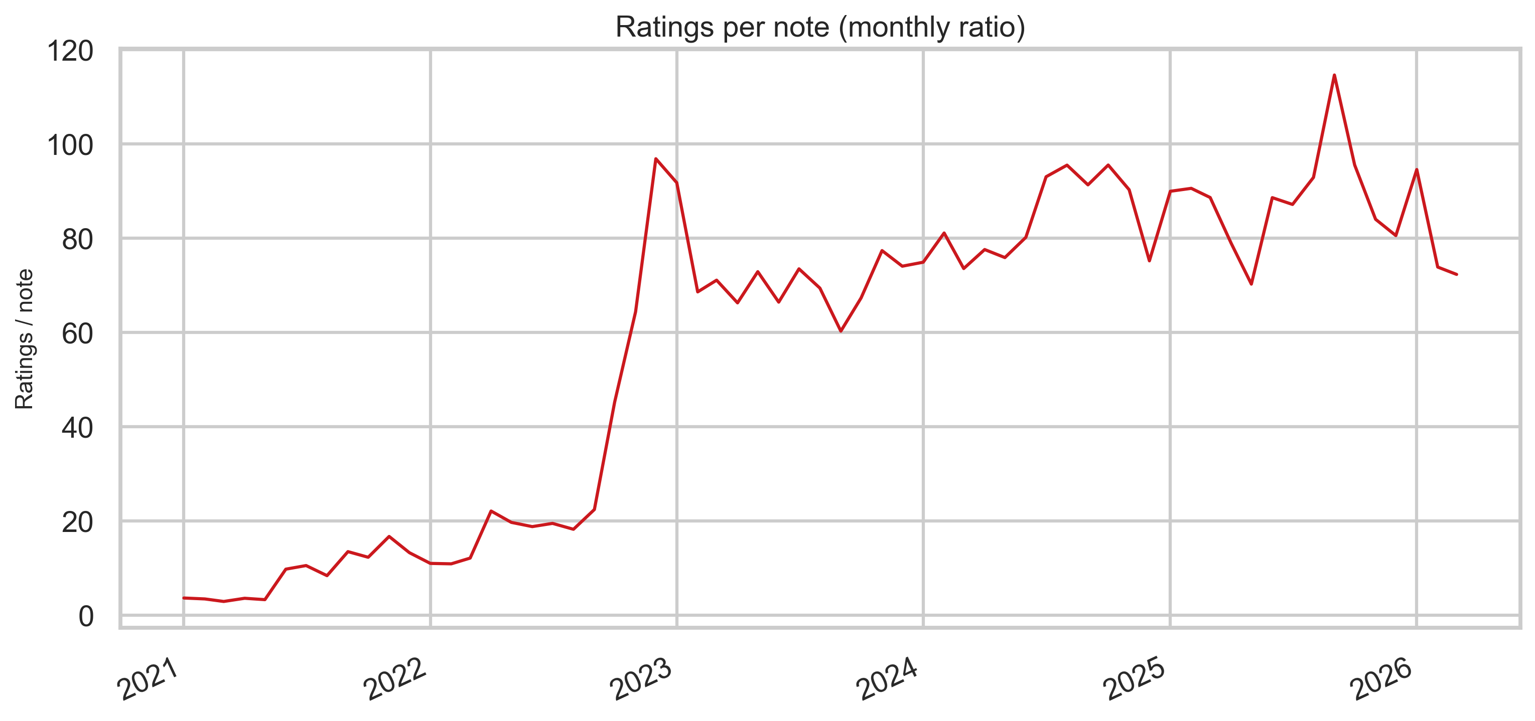
Ratings per note (monthly ratio)
Dividing monthly rating rows by monthly note rows gives a rough intensity measure: how “thick” the rating stream is relative to new notes each month (not identical to “ratings per note” at the tweet level, but useful for comparing eras).
Note content and labels
Classification
The export’s top-level classification field is dominated by MISINFORMED_OR_POTENTIALLY_MISLEADING versus NOT_MISLEADING rows in this file. The bar chart below is the source for the ~78% / ~21% split cited in the executive summary.
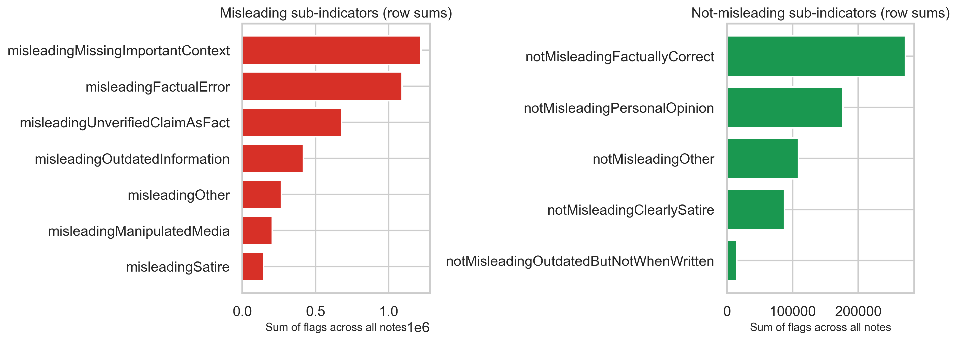
Misleading / not-misleading sub-indicators
Separate boolean-style columns capture why a note was judged misleading or not. Summing those flags across all note rows shows which reasons appear most often in the structured fields (not mutually exclusive per row).
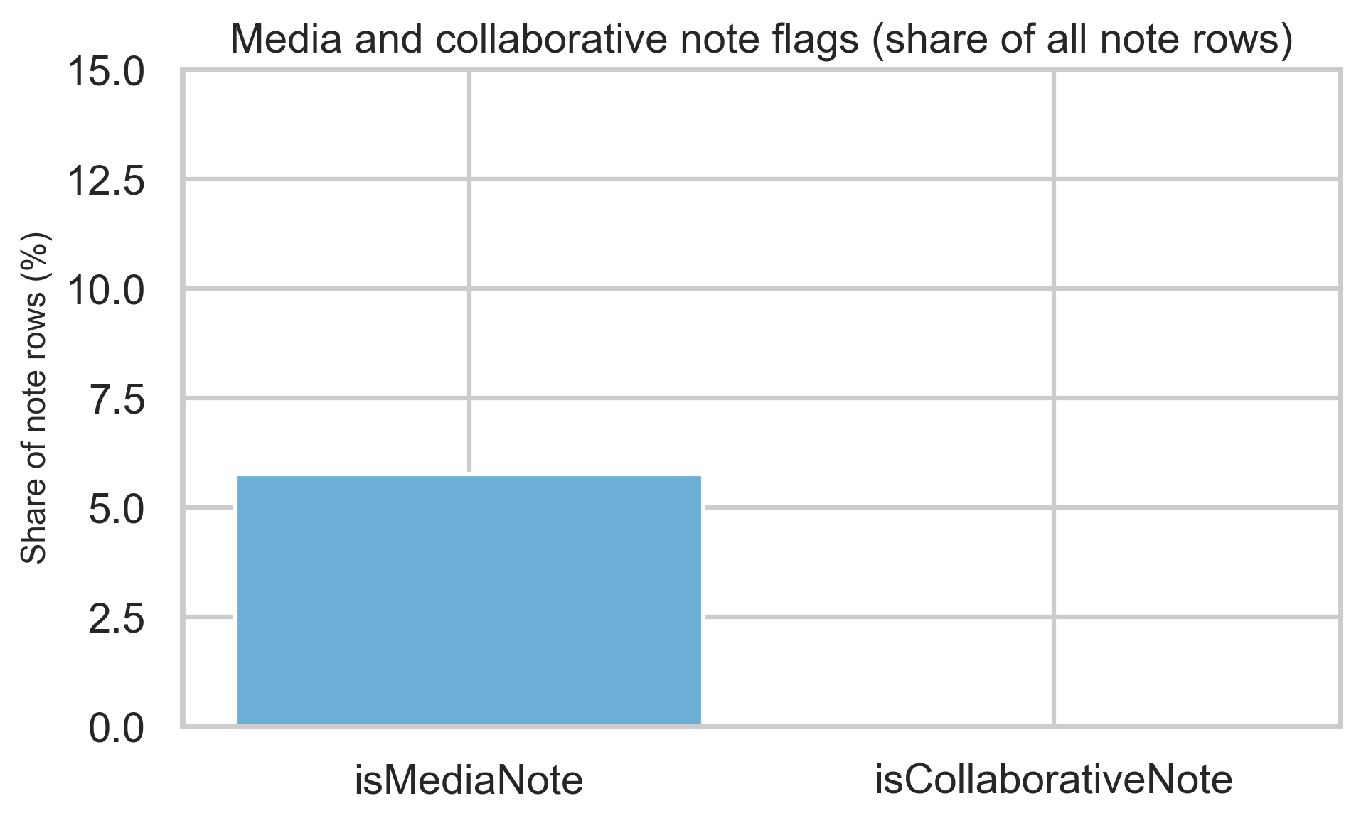
Media and collaborative notes
Media and collaborative flags are a minority share of rows but materially nonzero—useful context when interpreting note mix.
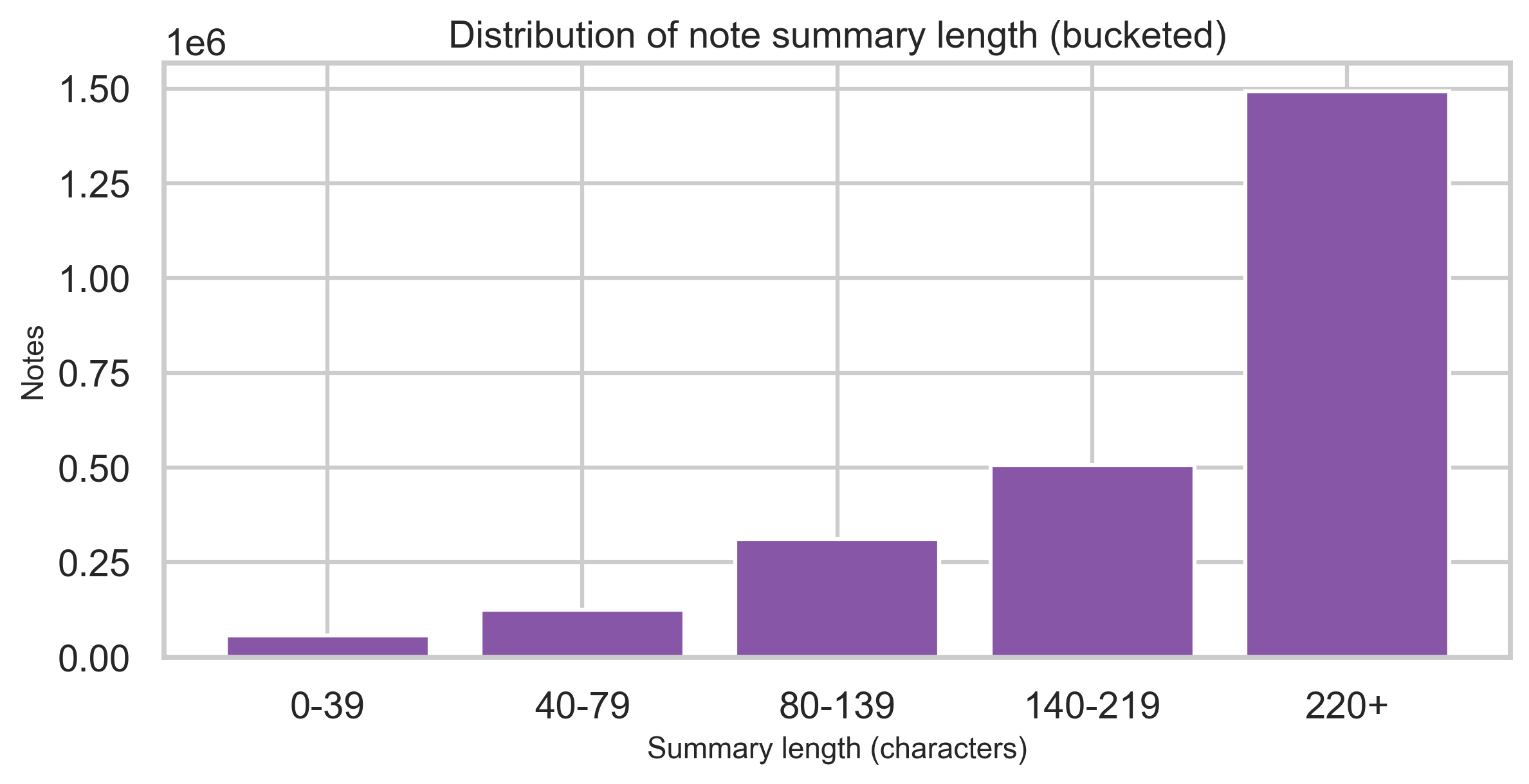
Summary length
Bucketed character counts of the summary field show where most notes sit in terms of length (without exposing text).
Ratings and helpfulness
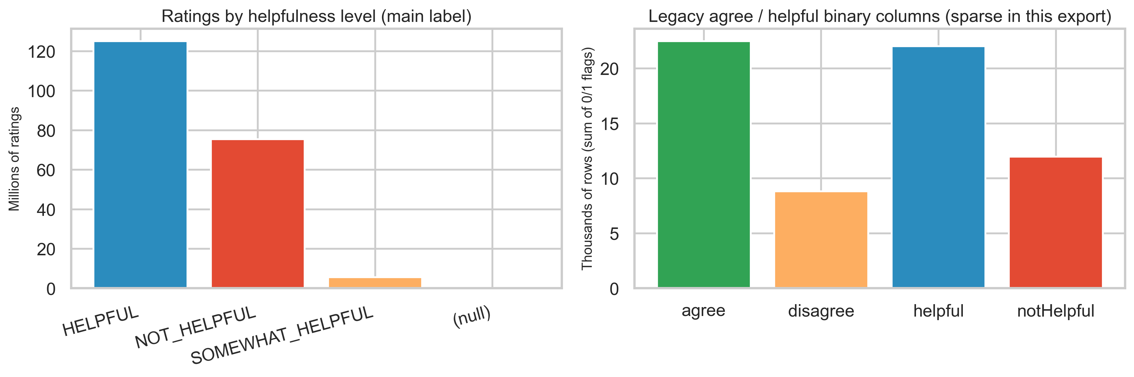
Helpfulness level vs legacy binary columns
In this export, helpfulnessLevel is populated for almost all rating rows (HELPFUL, NOT_HELPFUL, SOMEWHAT_HELPFUL). By contrast, the older agree / disagree / helpful / notHelpful binary columns have very few positive entries—only ~22K each for agree and helpful out of 206M rating rows—so descriptive work should lean on helpfulnessLevel and the detailed sub-dimension flags.
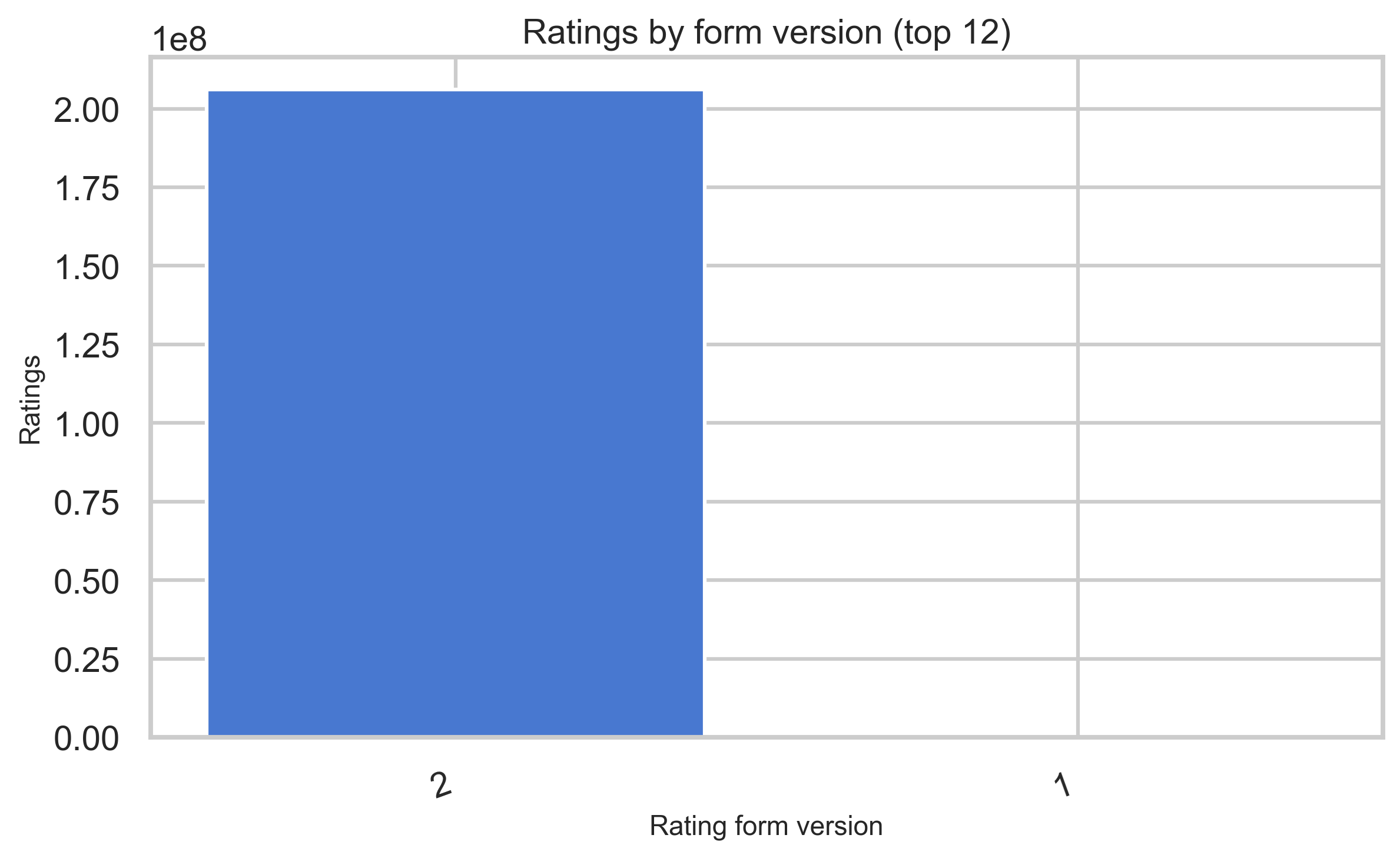
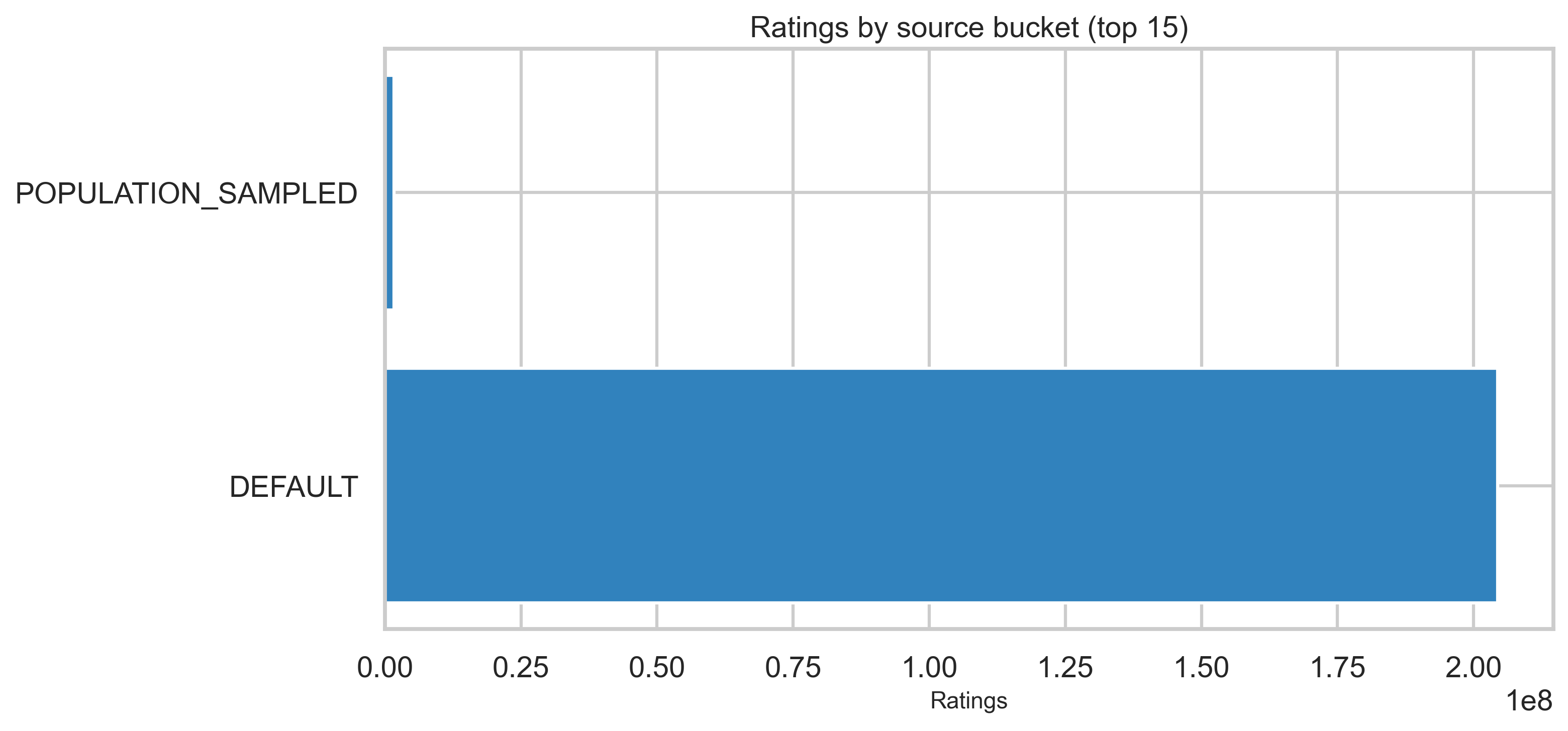
Form version and source bucket
Rating version strings shift over time as forms evolve; ratingSourceBucketed describes where the rating was submitted.
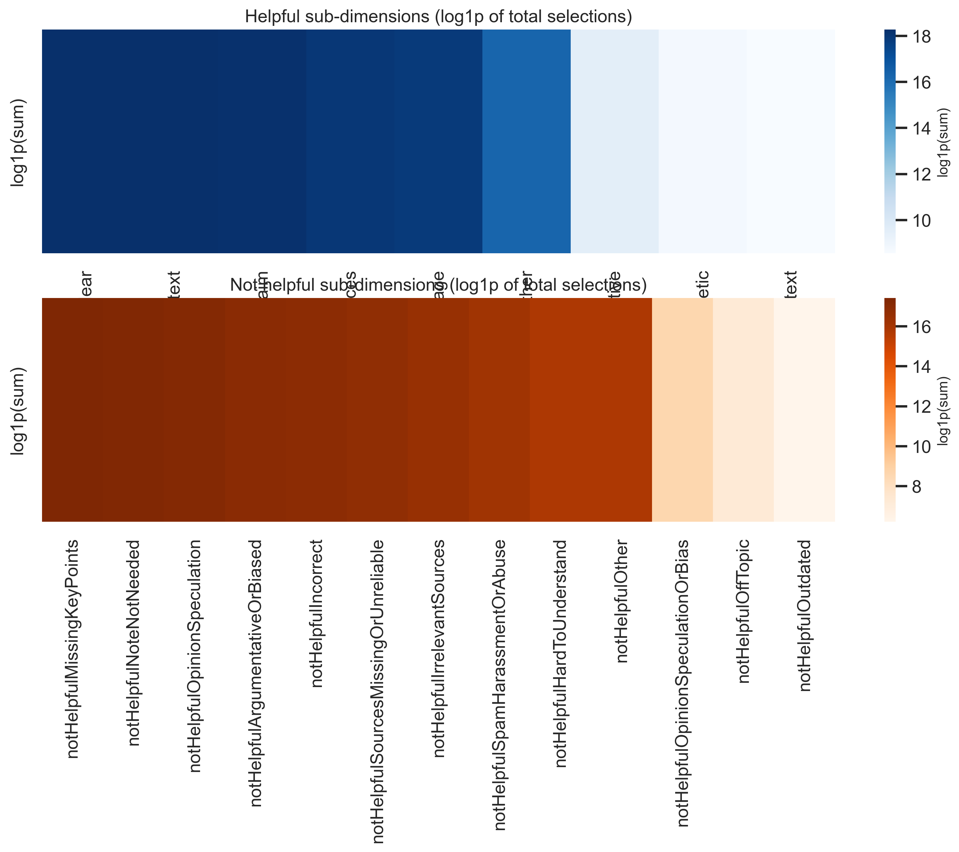
Sub-dimension totals
Finer “why helpful / why not” categories are aggregated with log1p scaling in the heatmaps so large totals remain comparable visually.
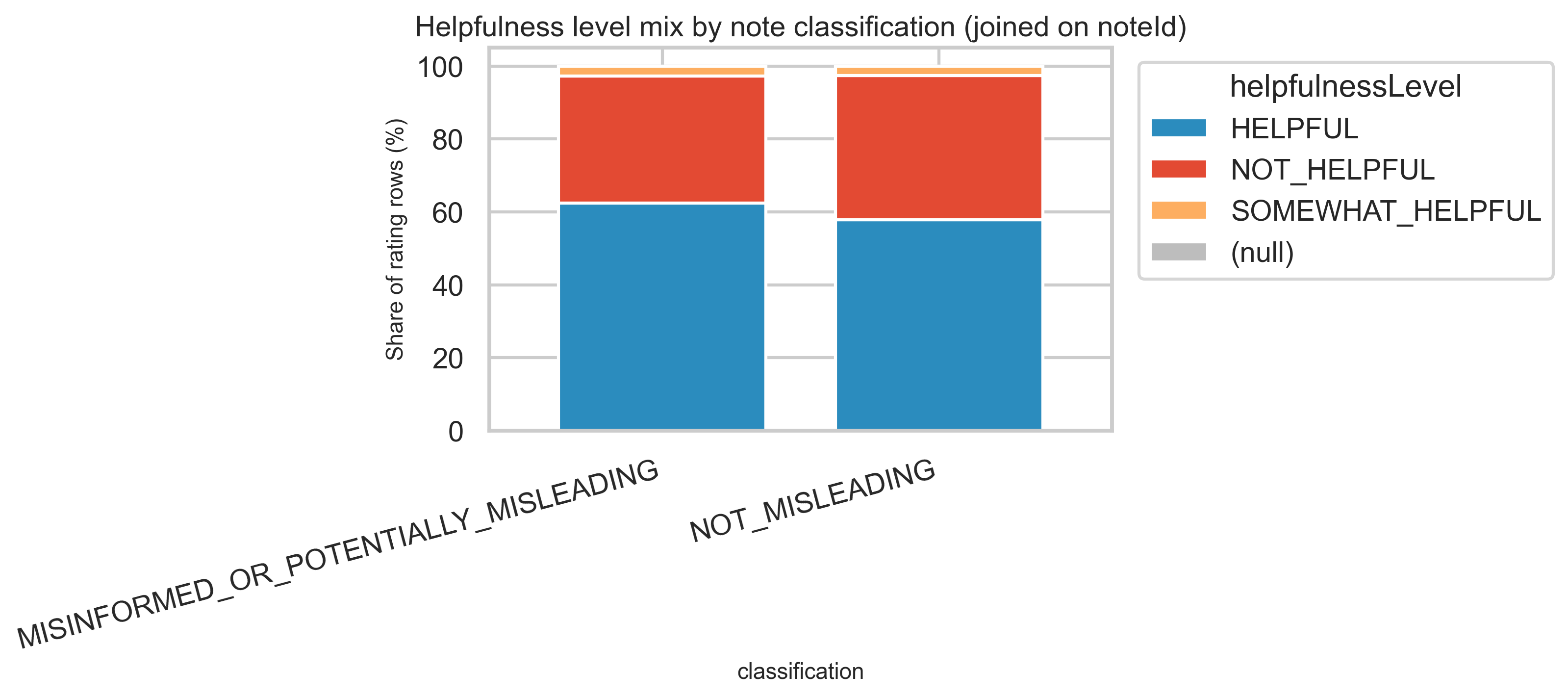
Joined view: helpfulness mix by note classification
Joining ratings to notes on noteId lets us compare how HELPFUL vs NOT_HELPFUL ratings distribute for notes tagged misleading versus not misleading at the classification level—again at aggregate scale only. Misleading notes receive both more ratings and a different mix: ~93M HELPFUL vs ~52M NOT_HELPFUL for misleading, vs ~21M HELPFUL vs ~14.5M NOT_HELPFUL for not-misleading.
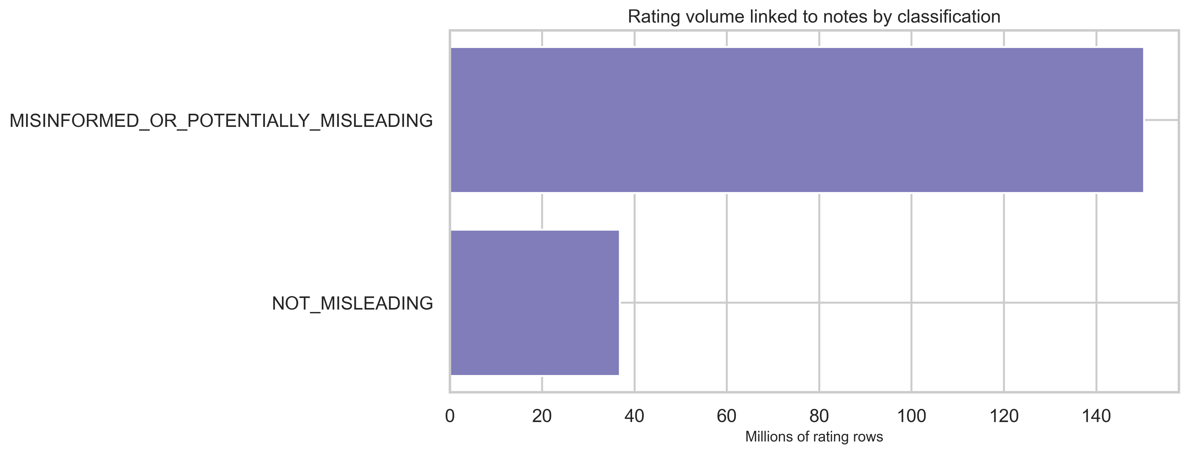
Rating volume by classification
Most rating rows link to MISINFORMED_OR_POTENTIALLY_MISLEADING notes in this snapshot, consistent with both higher volume and more contested content attracting ratings.
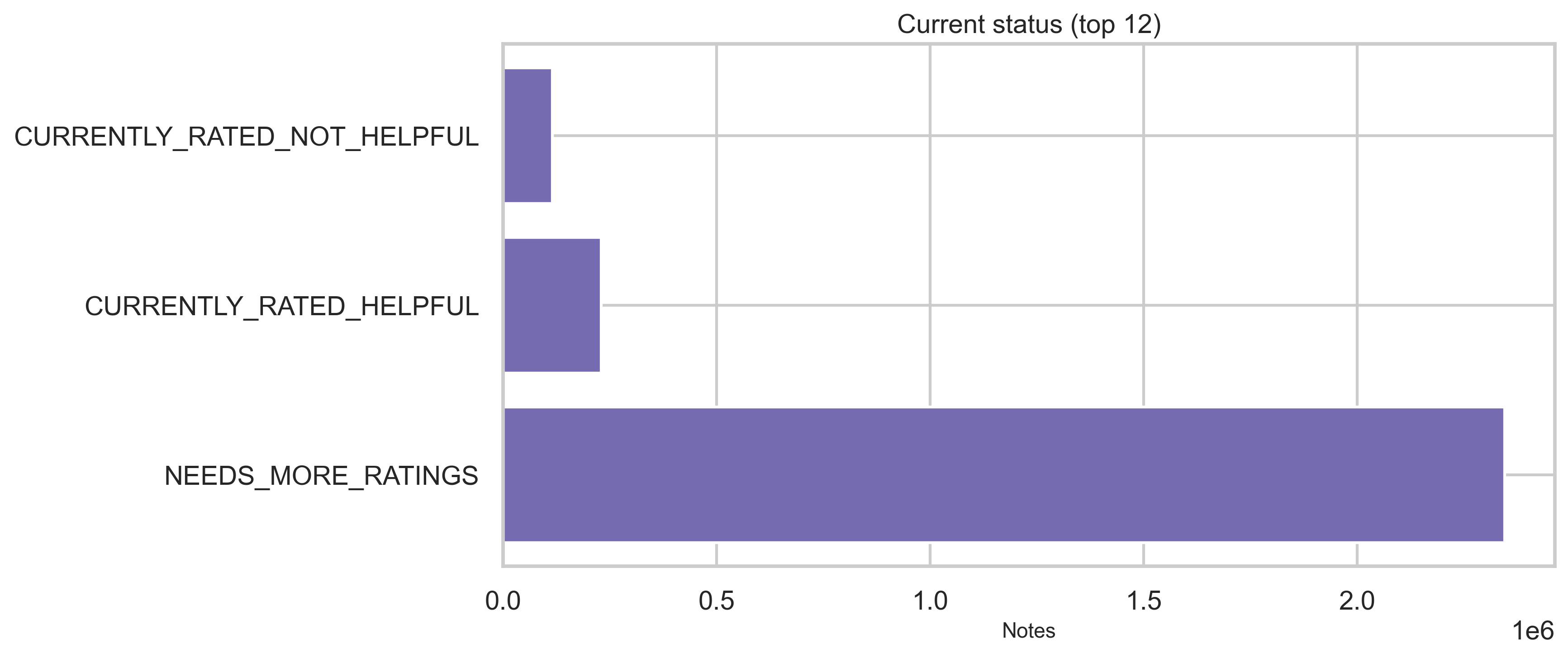
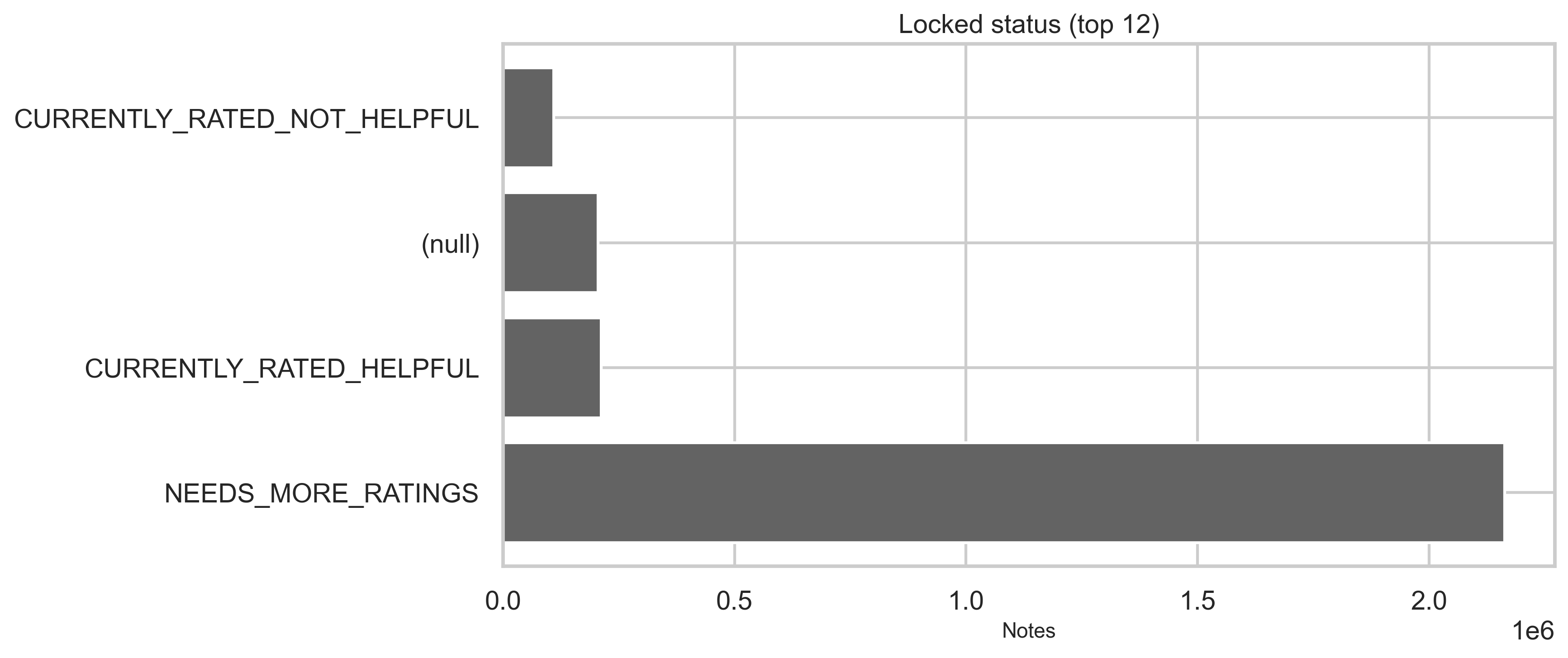
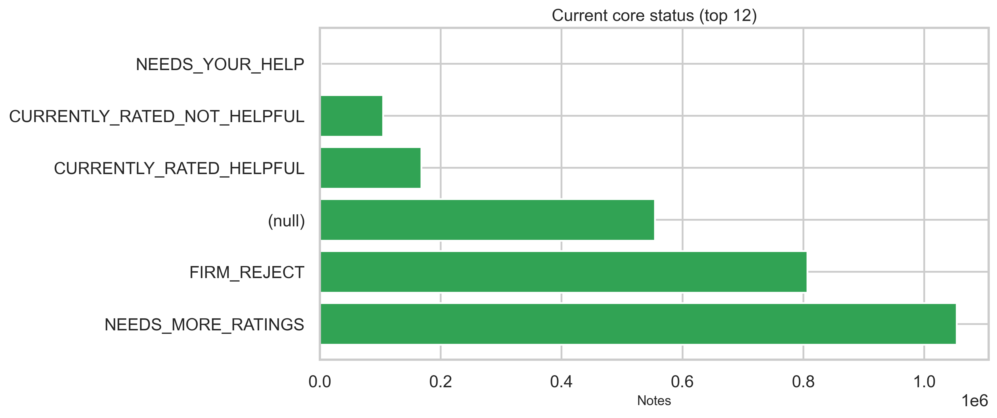
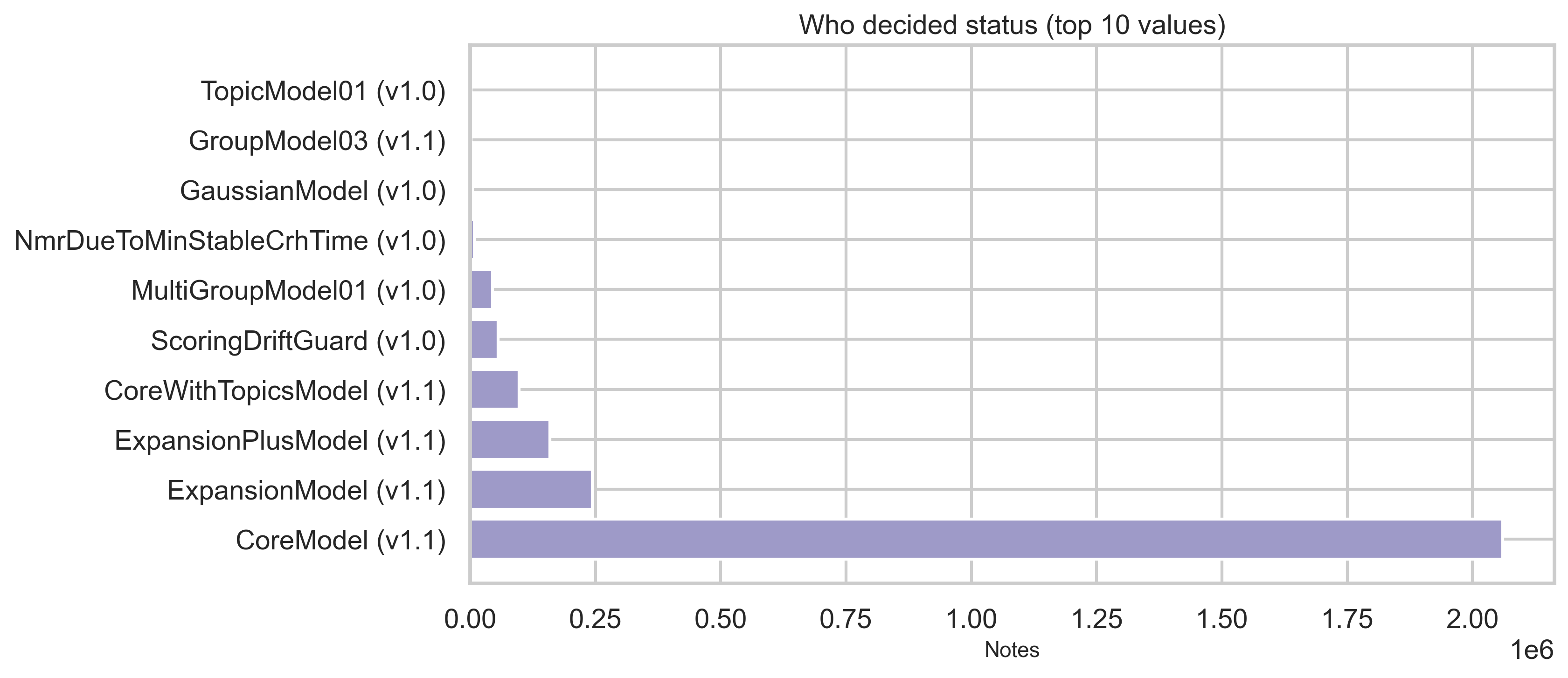
Lifecycle: status fields
Status tables provide current, locked, and core status dimensions plus who decided the status in modeled flows. Top categories are shown below (full distributions are in out/*.csv). The vast majority of status rows are NEEDS_MORE_RATINGS (~2.35M); CURRENTLY_RATED_HELPFUL and CURRENTLY_RATED_NOT_HELPFUL each sit in the hundreds of thousands.
What the status dimensions mean
- current: Reflects the display/outcome state of the note—e.g. whether it still needs more ratings or has been decided as currently rated helpful or not helpful.
- locked and core: Separate dimensions (e.g. lock state and “core” modeling status). The charts above show the top categories; full value sets and counts are in
out/status_by_locked.csvandout/status_by_core.csv.
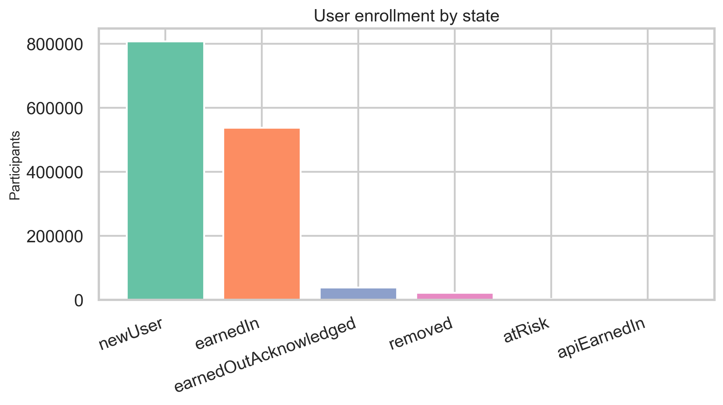
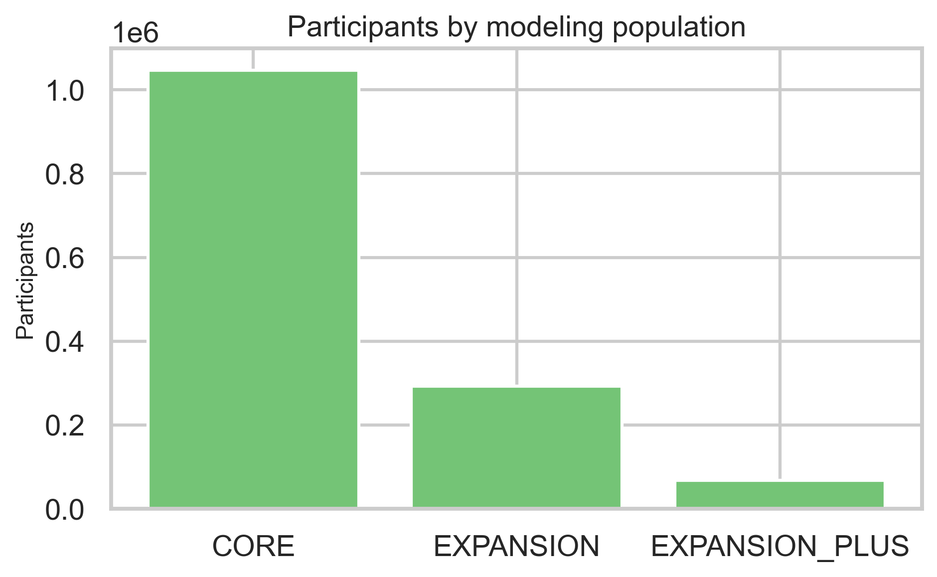
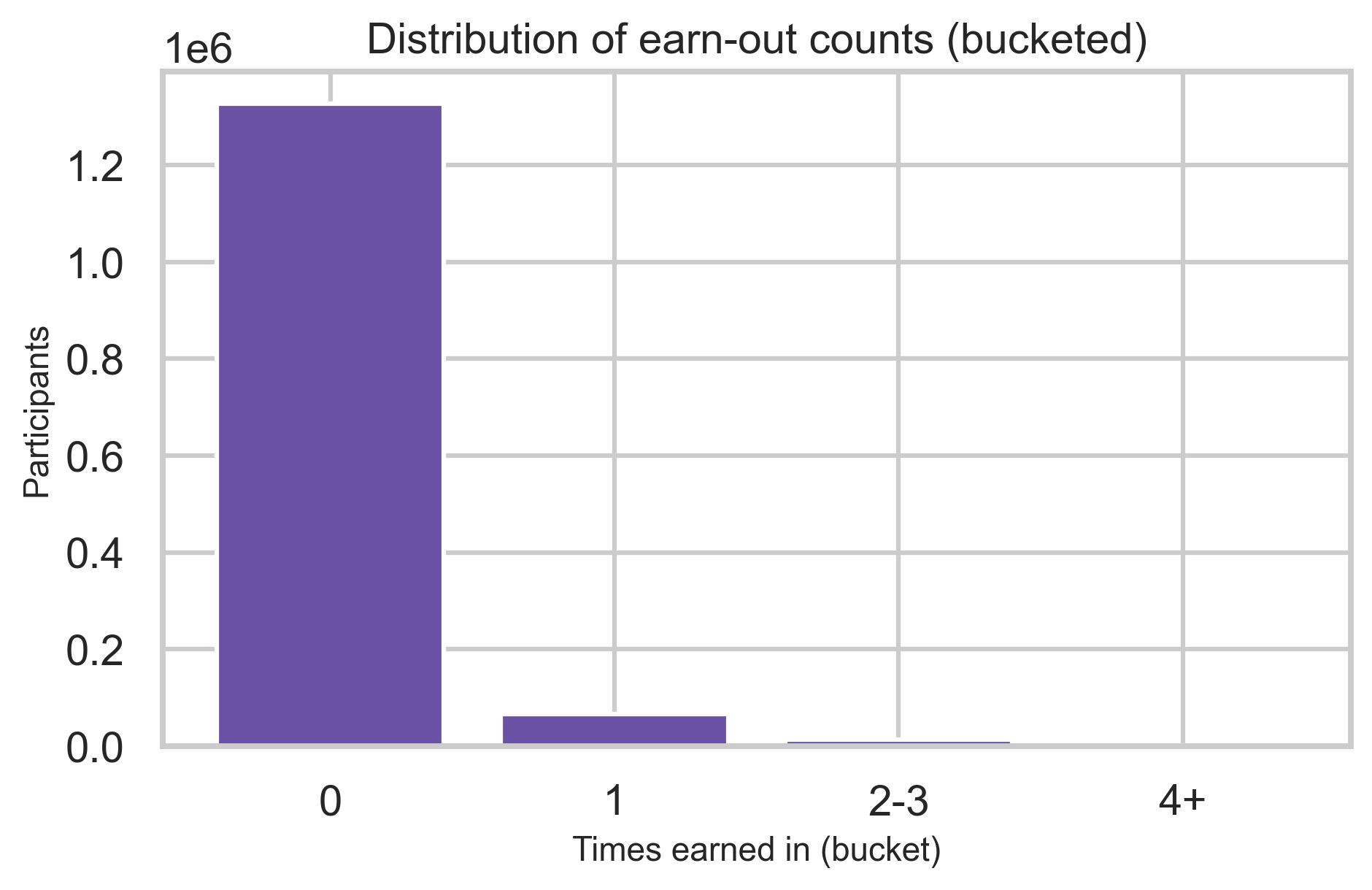
Participant ecosystem
Enrollment rows describe state (e.g., onboarding vs earned-in), modeling population, and how often participants earn in multiple times.
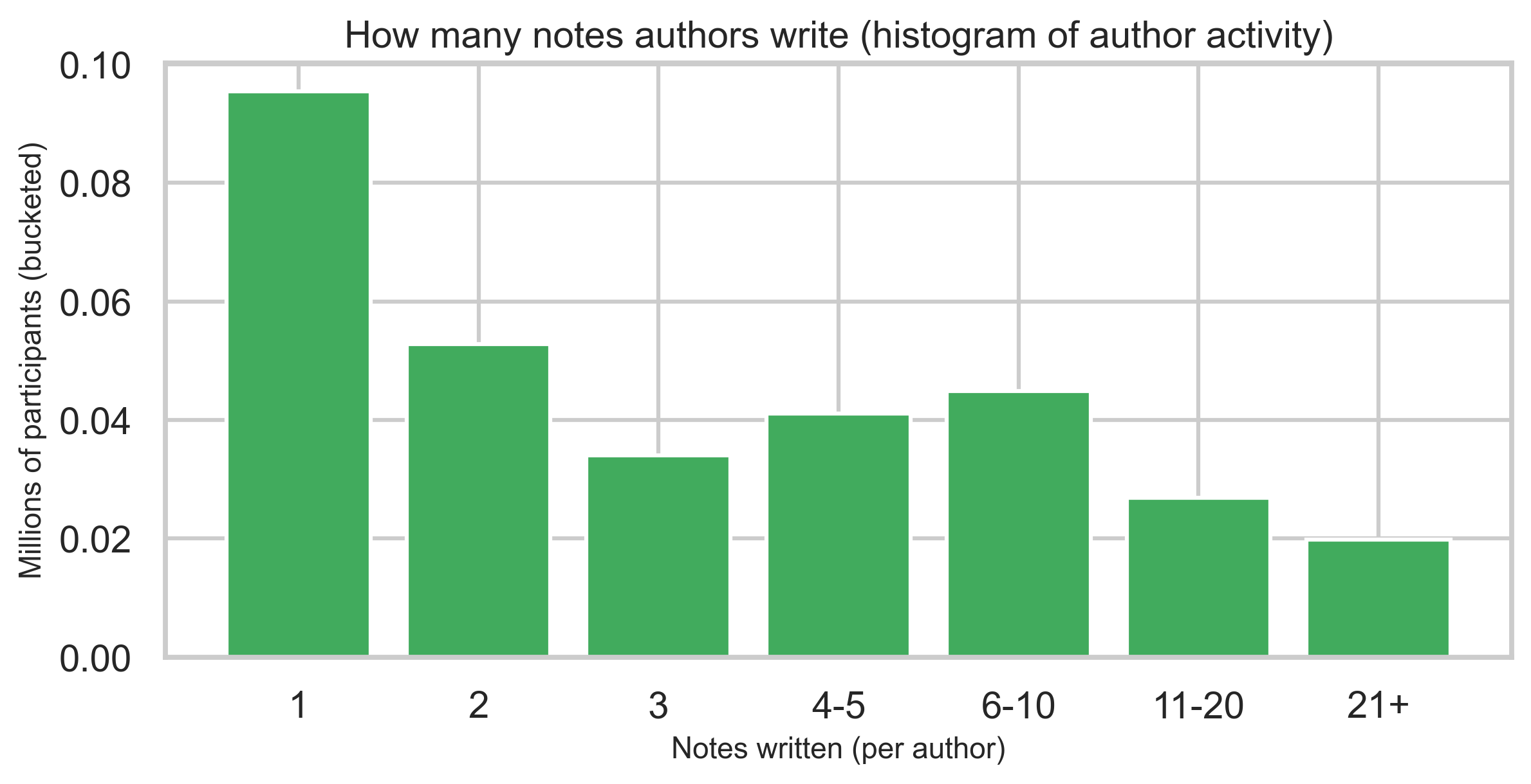
Contributor concentration
A binned histogram of how many notes each author has written shows heavy concentration among one-note contributors and a long tail of highly active authors—reported as bins, not identities.
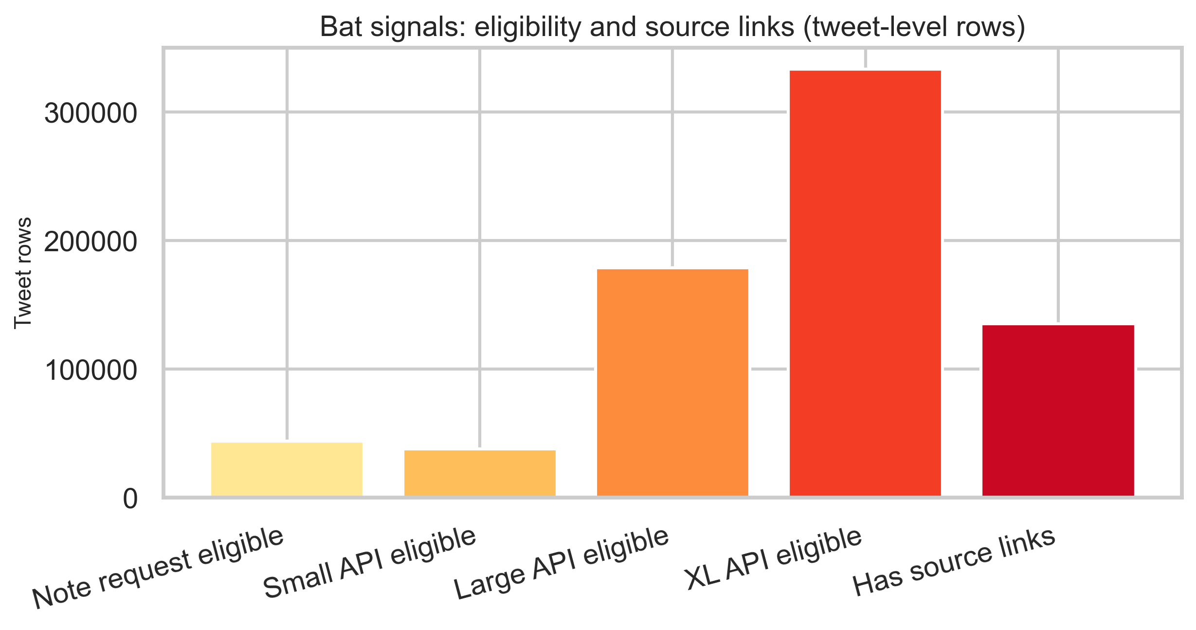
Bat signals and eligibility
Bat signal rows are tweet-level: several timestamp columns describe eligibility for note requests and API feed tiers, plus optional source links. Counts below are row-level, not unique-global tweet cardinality.
Limitations
- Snapshot only: Files reflect an export at a point in time, not live X.
- Schema evolution: Older ratings may use different form versions; compare with care.
- Join semantics: Joins are on
noteId; multiple notes per tweet and multiple ratings per note are expected. - Interpretation of sparse columns: Binary agree/helpful fields are not the primary signal in this extract—use
helpfulnessLeveland sub-flags. - Runtime: Full pipeline on this snapshot is ~5.4 minutes (from
metadata.json); ratings shards dominate. - Bat signals: Counts are row-level; no tweet-level deduplication is applied, so unique tweet cardinality is not stated.
Appendix: reproducibility
- Data source: Community Notes download data (X)
- Code:
analysis/community_notes/pipeline.py,plot_figures.py,config.py - Commands: From
analysis/community_notes/: runpython pipeline.pyto regenerate all aggregates, thenpython plot_figures.pyto regenerate figures. For a dry run on fewer ratings shards, usepython pipeline.py --ratings-limit-shards 1. - Aggregates:
analysis/community_notes/out/metadata.jsonand companion CSVs - Figures:
public/images/blog/x-community-notes-export/*.png(25 images)
If you expand this to other snapshots, re-run deduplication checks on any new notes-*.tsv pairs before combining totals.
Key fields reference
Values below are from this export’s aggregates; other snapshots may differ.
- Classification (notes): MISINFORMED_OR_POTENTIALLY_MISLEADING, NOT_MISLEADING
- helpfulnessLevel (ratings): HELPFUL, NOT_HELPFUL, SOMEWHAT_HELPFUL, and a small null share
- Status dimensions:
- current: NEEDS_MORE_RATINGS, CURRENTLY_RATED_HELPFUL, CURRENTLY_RATED_NOT_HELPFUL
- locked: NEEDS_MORE_RATINGS, CURRENTLY_RATED_HELPFUL, CURRENTLY_RATED_NOT_HELPFUL, (null)
- core (currentCoreStatus): NEEDS_MORE_RATINGS, FIRM_REJECT, (null), CURRENTLY_RATED_HELPFUL, CURRENTLY_RATED_NOT_HELPFUL, NEEDS_YOUR_HELP
Full value sets and counts are in out/status_by_current.csv, out/status_by_locked.csv, and out/status_by_core.csv.


